THE PROBLEM


about img
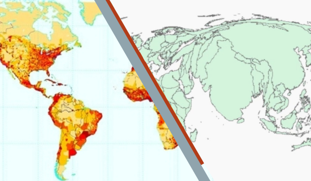
Cloropleth / Cartogram

We used to be constrained by static visuals

We have taken static geovisualizations (maps) as a given, but that is quickly changing – just think to the interactive maps we saw during the 2020 US Presidential Election. When it comes to displays of density, it seems like we're stuck in the twentieth century. Why not try something new? A static cartogram is a cool way to show variables such as population by making the area in a given region proportional to the number of people in that region. This can help us make sense of urban areas, which are difficult to dilineate with a hard line. However, cartograms can be tricky to interpret. A remedy for this is to show a map warping into a cartogram: the warping cartogram animation!

PROBLEM-SOLVING


The math behind the graph

The data used for this demonstration was extracted from the US Census website and from the ArcMap default library. This project was executed with ArcGIS software. The Gastner-Newman mathod to 'make a cartogram' was used to get the end state of the animation. To get a "step zero" that will animate smoothly to the end state, another manipulation will be necessary. This top equation will give us the data for 'dummy' population values to use for the census tracts. The bottom equation will then shift those population values smoothly until we get to 'step k' with the real population values. With each population step used as the basis for a differently warped cartogram map, we can then create an animation of the different steps.

about img

INTERACT


Warping World Cartogram

The World

This animation, especially when using the time slider to manually warp the cartogram, allows a user to participate in the process of assigning population to polygons, which helps with the interpretation of the data. That is the overall mission of geovisualization, and this animation works towards that mission by trying to increase accessibility and interpretability. A shortcoming of this animation is that all countries are grouped as a whole, so population distribution within a country is not accounted for. This is especially an issue in the United State - for example, Alaska takes on a large proportion of the United States' landmass, thereby shrinking the contiguous United States and expanding Alaska to an area that is much bigger than what it should be.


Warping Florida Cartogram

Florida

The benefits of the world cartogram animation are maintained and highlighted on the state level. This time a viewer gets to imagine urban areas and see how cities truly blow up in size. Focusing on the southeastern part of the tip illustrates this process with Miami. Try clicking and dragging the time slider to move through the animation. This is a big part of this visualization tool - interactive design. We are living in a time where we have to tools to allow for people to interact with once static products. This map is meant to be played with. This interaction fosters deeper learning and internalization of the information within.


Warping Texas Cartogram

Texas

Texas is an example of a state for which this visualization is perfect. The final state of the cartogram animation is almost unrecognizable as Texas, making it hard for a non-cartographer to interpret such a cartogram. This is a problem of accessibility, and a cartogram animation solves this problem. As the time slider moves right, a viewer can see the expansion of Dallas/Fort Worth, Austin/San Antonio, and Houston to the point where they dominate the entire state by area. Once again, 'urbanization' in a state like Texas is hard to describe, because people are not necessarily living in apartments downtown, but are rather concentrated in houses surrounding the cities. This cartogram clearly shows the "urban hubs" of Texas without needing to draw an arbitrary metro area line.


Warping Washington Cartogram

Washington

Like Texas, the final cartogram of Washington would be unrecognizable unless the viewer was told that it was Washington state. I chose Washington as an example because there is truly only one major city - Seattle. We see Seattle take shape (literally) as the animation progresses, dwarfing all other features of the state, except for Spokane. Before creating this cartogram, I did not know that Spokane existed; its survival of the Seattle onslaught brought it to my attention and revealed a small hub in Eastern Washington state of which I was formerly unaware.


Warping Massachusetts Cartogram

Massachusetts

The benefits of the world cartogram animation are maintained and highlighted on the state level. This time a viewer gets to imagine urban areas and see how cities truly blow up in size. Focusing on the southeastern part of the tip illustrates this process with Miami. Try clicking and dragging the time slider to move through the animation. This is a big part of this visualization tool - interactive design. We are living in a time where we have to tools to allow for people to interact with once static products. This map is meant to be played with. This interaction fosters deeper learning and internalization of the information within.

ABOUT

about img

Eitan Darwish, Author


I'm pursuing a degree in Quantitative Social Science with a focus on Public Policy at Dartmouth College. I live for real-world work, so while I love the liberal arts experience, I am a sucker for projects like these. I was assigned an open-ended prompt for my course in Geovisualization and went with this! After the class, I continued refining the presentation of the projects so as to make it most accessible.